The Home & Interior Blog
The Best Neutral Colour Combinations for Minimalist Spaces
There’s a common misconception that neutral interiors are cold, dull, or lifeless — stripped of personality in pursuit of simplicity. But if you’ve ever stepped into a well-designed minimalist space, you know that’s far from the truth. When used intentionally, a neutral home palette can create a sense of calm, cohesion, and timeless elegance that more saturated schemes often struggle to achieve.
Neutral colours have the unique ability to soothe without being sterile. They create space for your mind to rest, for textures to speak, and for light to dance across surfaces. In minimalist design, where less is more, your colour choices carry even more weight. Choosing the right combinations can make the difference between a flat, forgettable room and one that feels layered, grounded, and alive.
In this guide, we’ll explore the best minimalist colour ideas — from warm and cool tones to unexpected pairings — that bring character and serenity to any space.
Understanding the emotional impact of neutral tones
Before picking paint swatches or fabrics, it’s essential to understand how colour influences mood. Even within a neutral palette, subtle variations can change the entire feel of a room.
Warm vs. cool neutrals
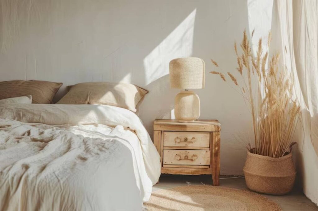
- Warm neutrals (like beige, sand, or creamy white) create an inviting, cosy environment. They’re perfect for living rooms and bedrooms.
- Cool neutrals (such as pale grey, stone, or soft greige) tend to feel more modern, crisp, and architectural — great for bathrooms or home offices.
The key is finding a calming colour scheme that reflects your personal energy while supporting the function of the space.
Timeless neutral pairings that always work
Neutral colour schemes are incredibly versatile — and when layered thoughtfully, they create a rich, organic feel.
Ivory and warm grey
This soft combination creates a warm, minimalist vibe without veering into rustic. Use ivory on walls to reflect light and warm grey for upholstery or cabinetry.
- Works beautifully with: brass hardware, linen textures, and wood tones
- Ideal for: bedrooms, lounges, or reading nooks
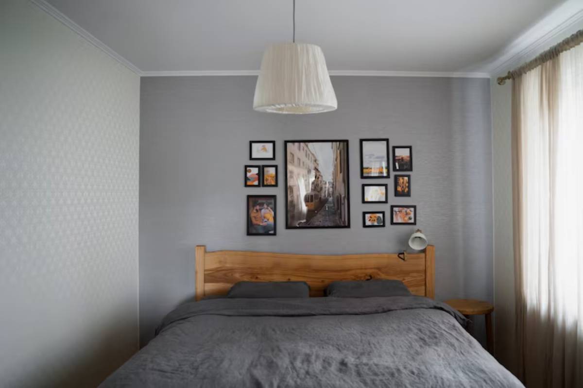
Greige and charcoal
Greige — a mix of grey and beige — paired with charcoal creates a grounded, modern feel. It’s sophisticated without being stark.
- Accent with: matte black frames, soft wool throws, and indoor plants
- Best used in: dining rooms or multipurpose areas where mood matters
Taupe and crisp white
Taupe adds warmth and depth, while white brings clarity and light. Together, they form a timeless base for minimalist styling.
- Compliments: minimalist artwork, ceramics, and glass
- Especially suited for: kitchens, bathrooms, and transitional spaces
Layering neutrals to add dimension
A common mistake in minimalist interiors is using just one or two colours, which can make a space feel flat or underwhelming. The secret is in layering — mixing tones, materials, and textures within the same palette.
Use contrast wisely
Even within a neutral range, contrast adds energy. Combine light walls with darker furniture, or vice versa. A stone-grey sofa against off-white walls offers subtle drama without chaos.
Texture over colour
When working with a tight palette, texture becomes your visual interest. Think:
- Nubby boucle cushions
- Raw wood frames
- Smooth ceramic vases
- Soft cotton or wool throws
These tactile elements bring warmth and personality to even the most pared-back spaces.
If this feels familiar, it aligns well with the ideas shared in using texture to add depth to minimalist rooms, where layering subtle differences creates atmosphere and elegance without adding clutter.
Matching neutrals with light and architecture
Colour doesn’t exist in a vacuum — it interacts with light, room size, and structural elements. A beautiful taupe in a showroom might feel murky in your north-facing bedroom.
Pay attention to natural light
- North-facing rooms benefit from warm neutrals to counteract cool light
- South-facing rooms can handle cooler tones without feeling cold
- East/west-facing rooms shift light throughout the day, so flexible neutrals like beige or mushroom work best
Always sample paint on multiple walls and at different times of day before committing.
Accent colours that don’t break the minimalist vibe
While neutrals are the foundation, accent colours can elevate a space, so long as they’re chosen thoughtfully.
Earth tones
Muted terracotta, olive, or ochre can be beautiful complements to beige or stone. They bring a sense of groundedness without overwhelming the scheme.
Soft pastels
Dusty rose, sage green, or pale sky blue can add serenity and sophistication. Use them sparingly — perhaps in a cushion, a print, or a single painted chair.
For a deeper dive into how to incorporate subtle colour variation, explore choosing accent colours without breaking the vibe, where subtlety and harmony remain at the heart of every design decision.
Using neutrals to create zones in open-plan layouts
Open spaces can be tricky — how do you define areas without using walls or busy colours?
Neutrals solve this elegantly:
- Use different shades of the same neutral to subtly separate zones (e.g. sandy beige in the living space and a cooler greige in the dining area)
- Employ rugs in contrasting textures or tones
- Paint built-ins or cabinetry a slightly deeper tone than the walls
This approach maintains flow while giving each area a defined identity.
Mistakes to avoid with neutral palettes
Even the most calming colours can fall flat if not applied with care. Watch out for these common missteps.
Going too cold
An all-grey palette can feel sterile without the right balance. Always include some warmth, whether through texture, wood, or soft lighting.
Ignoring undertones
Not all whites or greys are created equal. Some lean blue, pink, or green. Mixing undertones without awareness can cause clashing or an off-putting finish.
Lack of variety
If everything is the same beige, the eye has nowhere to land. Layer at least three variations of tone, texture, and finish.
Real-world inspiration: minimalist homes that get it right
Let’s look at how real people use neutral colour schemes to craft soulful, minimalist homes.
Nina’s coastal-inspired flat
Nina, a teacher living by the sea, uses ivory walls with soft sand-coloured cushions, driftwood shelves, and linen curtains. Her space feels warm, open, and calm, without a single bold accent.
Adebayo’s inner-city sanctuary
Adebayo balances greige walls with charcoal furniture, brushed metal accents, and eucalyptus sprigs in amber glass bottles. His flat blends masculine minimalism with a soft edge.
Freya’s family-friendly home
Freya mixes taupe and crisp white in a spacious open-plan home. She uses natural jute rugs and plenty of layered throws for warmth. Her children’s play area features soft pastel toys that blend beautifully into the palette.
These examples prove that minimalism and personal expression can — and should — coexist.
Conclusion: calm, clarity, and colour done right
A well-curated neutral home palette isn’t about stripping away colour. It’s about choosing with intention — selecting tones that reflect light, soothe the mind, and bring visual harmony to your home. Whether you’re layering greys and creams or warming things up with taupe and brass, minimalist colour schemes offer a timeless foundation for peaceful living.
At the heart of every calming colour scheme is a desire for simplicity and ease. And in today’s busy world, that kind of visual and mental relief is not just stylish — it’s necessary.


YOU MAY LIKE