The Home & Interior Blog
Using Texture to Add Depth to Minimalist Rooms
Minimalism is often mistaken for plainness — a sea of white walls, clean lines, and a noticeable absence of personality. But true minimalist design is never about stripping away warmth or life. In fact, it’s the subtle layering of elements — especially texture — that makes a minimalist room feel lived-in, calming, and beautifully curated.
When colour is muted and decoration is minimal, texture becomes the storyteller. It draws the eye, invites touch, and brings depth without clutter. Whether it’s the cool grain of concrete, the softness of brushed cotton, or the roughness of jute underfoot, texture bridges the gap between simplicity and richness.
In this article, we’ll explore how to use minimalist texture styling to create visually engaging spaces with depth in simplicity. From layered neutrals to contrasting finishes, these ideas will help you craft a home that’s minimalist but far from monotonous.
What do we mean by texture in minimalist styling
When we talk about texture in interiors, we’re referring to both tactile texture (how something feels) and visual texture (how something appears to feel). In minimalist design, the emphasis on pared-back palettes and open space places greater importance on these subtle details.
Common texture sources in minimalist homes:
- Natural materials: linen, cotton, wool, jute, wood, clay
- Surface finishes: matte, brushed, raw, woven, or rough
- Repetition of pattern or grain to create contrast
A successful minimalist space uses these textures to add variety, warmth, and a touch of the unexpected, without disrupting the calm atmosphere.
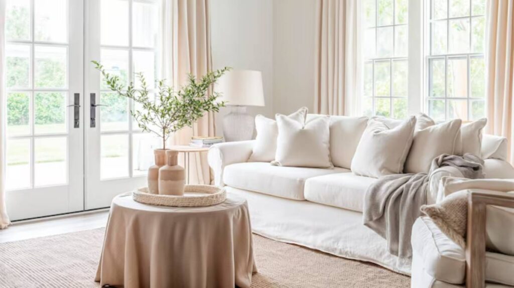
Why layered neutrals work so well
When decorating with neutrals, things can quickly feel flat if you’re not careful. Enter layered neutrals — a strategy that builds richness by stacking similar hues in varying textures and tones.
How it works:
- Use a base tone like ivory, taupe, or pale grey.
- Add subtle contrast with throws, rugs, or cushions in related tones.
- Introduce materials with distinct feels, such as chunky wool, fine linen, or ribbed cotton.
The beauty of layered neutrals lies in their quiet sophistication. They whisper rather than shout, creating harmony that soothes the eye and the nervous system.
This concept ties seamlessly with principles found in the best neutral colour combinations for minimalist spaces, where thoughtful layering adds dimension and warmth to otherwise understated palettes.
Elevating minimalist rooms through material contrast
One of the most effective ways to introduce texture is by pairing contrasting materials. The juxtaposition between soft and hard, matte and shiny, smooth and rough creates quiet visual tension — a hallmark of refined minimalist interiors.

Winning combinations include:
- Woven jute rugs beneath smooth concrete floors
- Matte ceramic vases on polished stone countertops
- Soft linen bedding against raw timber bed frames
- Leather cushions paired with wool throws
You don’t need loud colours or ornate patterns to make a statement. These understated contrasts do the heavy lifting in minimalist design, grounding the space while adding interest.
Key textural elements for each room in your home
Let’s break down how you can apply depth through texture, room by room.
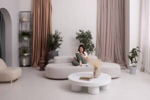
Living room
- Cushions in boucle, velvet, or thick cotton
- Throws are draped casually over a chair or armrest
- Curtains in lightly crumpled linen or soft sheers
- Rugs with high pile or woven detail
Use layered neutrals to differentiate zones without visual clutter. A well-placed rug or accent chair can add texture and break up uniformity.
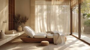
Bedroom
- Bedding in layers: crisp sheets, soft duvets, waffle-weave throws
- Bedside tables in raw wood, rattan, or metal
- Lighting in tactile finishes — think ceramic, paper, or brushed brass
The bedroom benefits from touchable comfort, so go heavy on soft, natural textures that invite relaxation.
Bathroom
- Towels in varying weaves and finishes (waffle, terry, fringed)
- Accessories in stone, glass, or matte ceramics
- Storage baskets made from seagrass, cane, or bamboo
Texture here doesn’t just serve aesthetics — it enhances the spa-like, grounded vibe you want in a minimalist washroom.
Kitchen and dining area
- Wooden or stone chopping boards on display
- Matte ceramic plates and hand-blown glassware
- Textile placemats in rough-spun cotton or linen
Functional items can also act as decor in minimalist kitchens, especially when chosen for their textural quality.
The role of architectural texture
Texture isn’t limited to soft furnishings. The architectural bones of your space — walls, ceilings, floors — are powerful contributors to mood and depth.

Ideas to explore:
- Exposed brick or stone walls
- Fluted timber panelling or slatted wood accents
- Textured wall finishes like limewash or microcement
- Polished vs. matte concrete surfaces
These elements become quiet focal points, anchoring the space without adding noise.
If you’re also exploring options like natural finishes, you might find helpful crossover with insights from raw finishes that complement minimalism, where honest, imperfect materials create elegant depth.
Lighting’s impact on texture
Texture doesn’t exist in a vacuum. Lighting plays a huge role in how it’s perceived.
Use light to highlight texture:
- Angle floor lamps toward woven curtains or baskets
- Use pendant lights to cast soft shadows across tactile surfaces
- Choose warm bulbs to bring out the depth in natural fibres and wood grains
The same fabric can appear flat under cold overhead light and beautifully textured under a warm, diffused glow.
Common mistakes to avoid with minimalist texture styling
Even with the best intentions, textural styling can go awry. Here’s what to watch for:
1. Over-texturing
When every item competes for attention — a shaggy rug, fringed cushions, macramé wall hangings, embossed ceramics — it can feel chaotic. Balance smooth surfaces with rough ones to keep things intentional.
2. Ignoring tone harmony
Mixing too many undertones (cool greys with warm beige, for example) can cause visual disharmony. Stick to a consistent tone direction for cohesion.
3. Flat backdrops
If your base (walls, flooring) is too uniform in finish and tone, even the best styling can fall flat. Add subtle variation through wall finishes or flooring grain.
Real-life examples of texture done right
Lara’s Scandinavian-inspired flat
Lara layered beige-on-beige in her living room: a boucle armchair, oak coffee table, and a wool rug. Despite a muted colour palette, the room feels inviting and warm thanks to her use of texture.
Marcus’s urban studio
Marcus balanced concrete walls with soft leather seating and heavy linen curtains. He used texture to soften an otherwise industrial space, creating a minimalist yet cocooning atmosphere.
Emilia’s minimalist family home
Emilia uses layered textures in unexpected ways — smooth river stones in a wooden bowl, a handmade ceramic lamp on a marble console. Her home feels curated yet comfortable, proof that simplicity doesn’t mean lack of expression.
Conclusion: Embrace depth without distraction
When done right, minimalist texture styling adds richness without clutter, movement without mess, and elegance without excess. It’s the secret sauce that gives minimalist spaces their soul.
Whether you’re starting with a blank slate or fine-tuning a space that already leans minimal, layering textures and layered neutrals can help you create rooms that feel calm, cohesive, and quietly compelling. It’s a practice in restraint — not deprivation — and it leaves room for both creativity and calm.


YOU MAY LIKE