The Home & Interior Blog
How to Balance Cool and Warm Minimalist Tones
There’s a quiet sophistication in minimalist design. It’s calm, measured, and beautifully restrained. But within this simplicity lies a challenge — how do you create a space that feels warm, inviting, and full of character without overwhelming its minimalist nature?
One of the most underrated design skills is learning how to balance cool and warm minimalist tones. Get it wrong, and the room might feel disjointed or sterile. But get it right, and you unlock a world of soft modern colours that feel layered, harmonious, and emotionally resonant.
In this guide, we’ll explore the nuance behind minimalist tones, how to build a warm neutral interior without heaviness, and why the most memorable spaces often blend temperature contrasts with intention and ease.
Understanding colour temperature in minimalist palettes
Before diving into styling, it helps to ground ourselves in the basics of colour temperature — how we perceive hues as either cool or warm.
Cool tones typically include:
- Light greys
- Soft blues
- Muted greens (sage, mint)
- Crisp whites with a blue undertone
These tones are often described as calming, clean, and airy — perfect for minimalist design.
Warm tones include:
- Beiges, taupes, and creamy whites
- Terracotta and clay
- Warm wood finishes
- Ochres and dusty pinks
Warm tones bring a sense of comfort and grounding, making a minimalist space feel less clinical.
When paired well, cool and warm tones don’t clash — they complement. The contrast between them creates dynamic balance and emotional richness.
Why the balance matters in minimalist interiors
In spaces where decoration is pared down and excess is removed, every choice matters more, especially colour. Without contrast or variety, a space risks feeling flat or too cold. But too much warmth can overwhelm the calm you’re aiming for.
Blending minimalist tones gives you:
- Depth: Even a single-material room can feel complex with the right temperature layering.
- Movement: Your eye naturally moves between tonal highs and lows, keeping the space interesting.
- Versatility: The room adapts well to lighting shifts, seasonal changes, and evolving styles.
Done right, it’s the sweet spot between serene and soulful — the kind of space you don’t just admire, but feel.
Start with a neutral base: the foundation for balance
Whether you’re starting from scratch or editing an existing space, every minimalist palette should begin with a solid foundation.
Best neutral bases for tonal flexibility:
- Greige (grey + beige): Naturally bridges cool and warm
- Ivory or off-white: Warmer than stark white, but still crisp
- Pale taupe: Feels earthy yet modern
These base tones offer flexibility — they allow you to layer cooler or warmer elements without either side dominating.
This same principle is echoed in guides like the best neutral colour combinations for minimalist spaces, where starting with a flexible base helps anchor the entire palette.
Layering warm and cool tones: a room-by-room guide
Let’s explore how this tonal balance plays out in different parts of the home — each with its own function and mood.
Living room
The heart of the home should feel calm but welcoming. Balance here often starts with large anchor pieces like sofas or rugs.
- Cool base: Light grey sofa or concrete coffee table
- Warm accents: Tan leather cushions, a jute rug, oak shelving
- Bridging elements: Soft beige walls, off-white curtains
Keep materials varied — rough linen, smooth ceramics, and soft wool help the colours feel intentional rather than accidental.
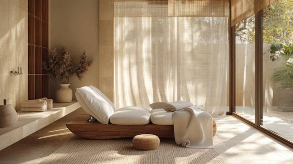
Bedroom
This is where warmth is most comforting. But adding cool accents can stop it from feeling stuffy or dated.
- Warm base: Taupe walls or a natural wood headboard
- Cool layering: Grey linen bedding, a slate-toned rug
- Soft contrast: Creamy throws, soft blush cushions
The bedroom benefits from more softness and layering — think tactile warmth and visual rest.
Kitchen and dining
These are practical spaces, but they benefit from tonal contrast that makes them feel less utilitarian.
- Cool base: White cabinetry with grey undertones
- Warm contrast: Wooden countertops, brass taps, terracotta pottery
- Bridging touch: A warm stone backsplash or natural floor tile
Use lighting wisely here — warm bulbs soften cool materials and help unify the space.
Materials and finishes: the key to harmony
Tonal balance isn’t just about colour — materials and finishes affect perception too.
Cool finishes:
- Stainless steel
- Concrete
- Polished marble
- Clear glass
Warm finishes:
- Natural oak
- Clay tiles
- Brushed brass
- Textured linen
Pairing these creates balance and visual depth. For instance, a concrete benchtop can feel warmer when surrounded by soft wood cabinetry and wool upholstery.
This layered pairing approach mirrors advice from using texture to add depth to minimalist rooms, where finish and feel are just as powerful as colour.
Lighting: the final piece of the tonal puzzle
You can have the perfect colour palette, but if the lighting is off, the tone can shift dramatically.
Natural light:
- East-facing rooms may feel cooler — balance with warmer tones
- South-facing rooms can handle cooler hues — lots of daylight helps
Artificial light:
- Warm bulbs (2700K–3000K): Best for bedrooms and living areas
- Cooler bulbs (4000K+): Great for kitchens and task lighting but should be softened with warmer elements
Even cool tones can feel inviting when lit right. And warm tones stay grounded when they don’t overwhelm the room’s natural brightness.
Mistakes to avoid when mixing warm and cool tones
Striking a balance is an art, but a few missteps can throw the whole vibe off.
1. Mixing undertones blindly
Ivory and icy white might both be “neutrals” — but when placed together, they can feel mismatched. Always check that your tones relate, even across different palettes.
2. Going to 50/50
Balance doesn’t mean equal parts. It’s about harmony. Let one temperature take the lead (often the base tone), and use the other as contrast.
3. Over-layering contrast
Too many contrast points — a cool wall, warm floor, cool sofa, warm rug — can cause tonal confusion. Aim for 2–3 main contrasts, with softer bridging tones between.
Real-world tonal harmony: homes that blend it well
Maya’s open-plan flat
Maya painted her open-plan lounge in soft greige, layered with pale grey seating, cream curtains, and oak flooring. A dusty rose accent chair adds warmth, while matte black fixtures ground the scheme.
Eli’s minimalist kitchen
Eli’s minimalist kitchen has sleek white cabinets, a grey marble benchtop, and brass tapware. Warm-toned stools and clay-toned pottery soften the industrial feel without adding clutter.
Noura’s relaxing bedroom
Noura chose a light beige wall colour and added soft grey bedding, warm white pendant lights, and layered linen throws in dusty lilac. The result? A serene, balanced retreat.
Conclusion: Your minimalist home deserves both clarity and comfort
Balancing minimalist tones isn’t about following rigid colour rules. It’s about tuning into how you want your space to feel, then using the full spectrum of warm and cool to support that mood.
A warm neutral interior can still have crispness. A soft modern colour scheme can feel fresh without coldness. It’s all in the layering, the materials, the subtle contrasts that invite you to look — and linger.
Minimalism isn’t about the absence of colour or warmth. It’s about harmony. And when you strike that balance just right, your home becomes a space that holds both peace and personality.


YOU MAY LIKE