The Home & Interior Blog
Choosing Accent Colours Without Breaking the Vibe
Minimalism often conjures images of white walls, greyscale furniture, and a strict “no fun” palette. But the truth is, minimalism isn’t about removing joy — it’s about elevating intentionality. The key to introducing subtle accent colour into a minimalist home is to do it with purpose, harmony, and restraint.
Used well, a whisper of colour can transform an otherwise subdued room into something layered and soulful. It gives your space a signature, a hint of personality, and a point of visual interest, without disrupting the calm you’ve carefully curated.
In this guide, we’ll show you how to select, position, and layer colour accents within your modern minimalist decor, helping you strike the perfect balance between warmth and clarity.
Why colour still matters in minimalist design
While minimalism prioritises simplicity, clean lines, and space to breathe, that doesn’t mean your interiors must be devoid of colour. In fact, a carefully chosen hue can bring emotional depth and visual rhythm to your environment.
Here’s what colour adds to minimalism:
- Contrast: Highlights architectural or design elements that might otherwise go unnoticed.
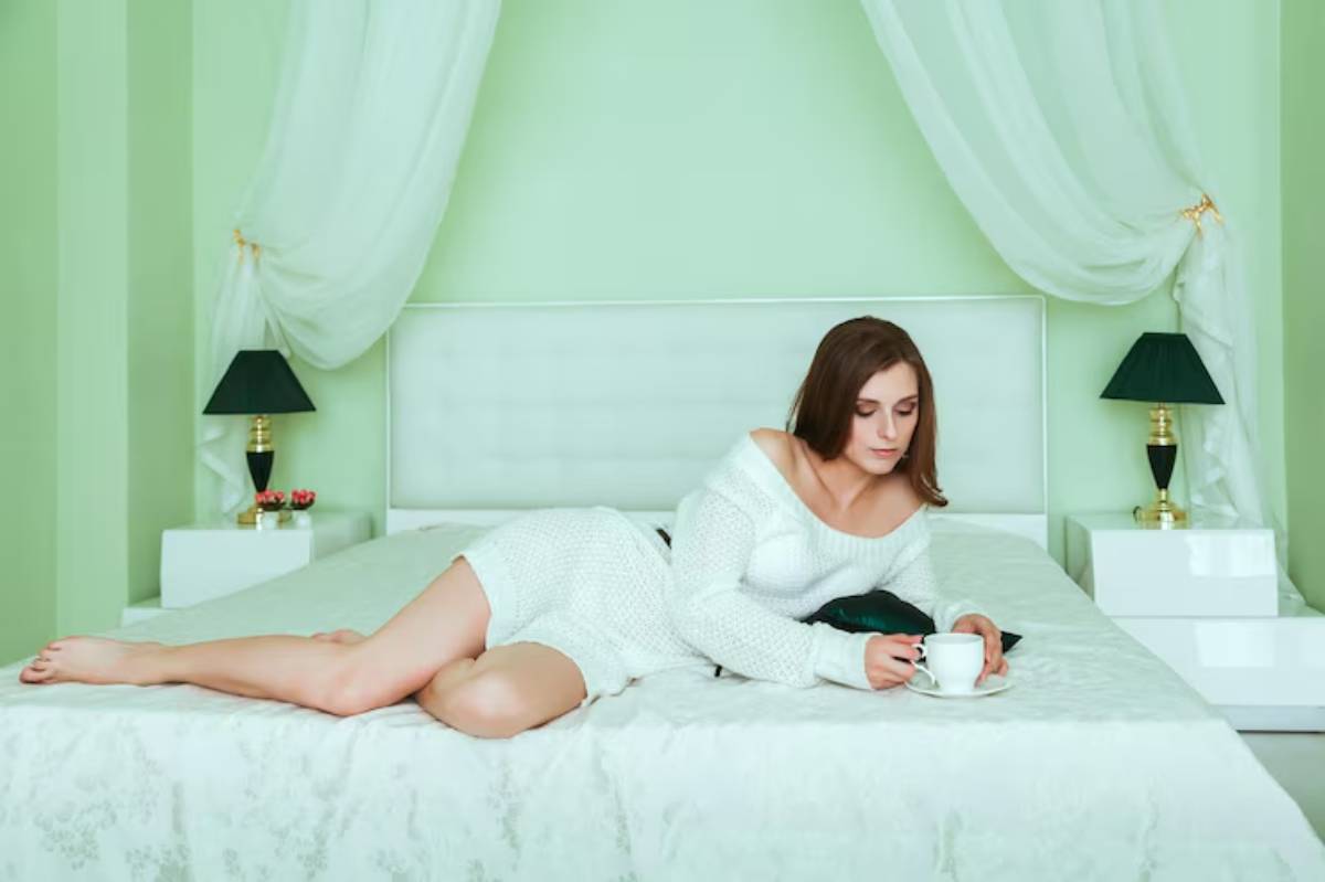
- Mood: Colours like sage, blush, or terracotta evoke specific feelings — calm, warmth, grounding.
- Character: In neutral-heavy spaces, colour gives a sense of identity and style.
When integrated with restraint and intention, colour supports — rather than interrupts — the serenity of a minimalist space.
Understanding colour harmony in neutral spaces
Before picking up a swatch book, it helps to understand colour harmony — the balance and relationship between hues in a room.
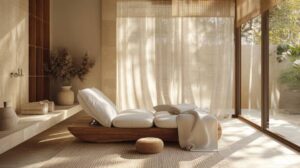
Start with a neutral foundation
Most minimalist spaces begin with a base of whites, greys, taupes, or beiges. These serve as the visual canvas upon which you layer your accents.
- Warm neutrals (e.g. creamy white, oatmeal) pair well with warm accents like terracotta, ochre, or blush.
- Cool neutrals (e.g. crisp white, pale grey) work beautifully with soft blue, sage, or lavender.
Keeping your accent tones aligned with the base undertones ensures cohesion and calm.
If you’ve already explored the best neutral colour combinations for minimalist spaces, you’ll notice how these pairings work in layers, subtly drawing the eye without demanding attention.
Choosing your signature accent hue
Your accent doesn’t have to be bold to be effective. In minimalist interiors, subtlety is key. Think muted, softened, or dusty tones rather than vivid or saturated shades.
Reliable minimalist-friendly accent colours include:
- Sage green: Earthy, calming, and timeless
- Terracotta or clay: Adds warmth and grounding energy
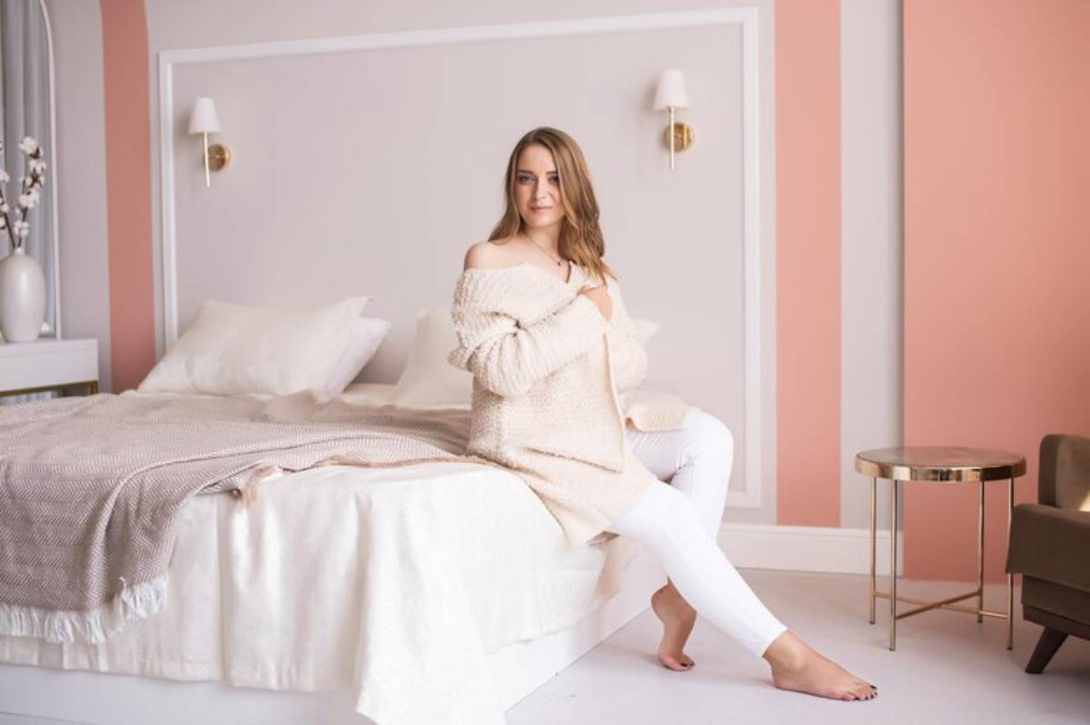
- Dusty rose or blush: Softly romantic and neutral-adjacent
- Slate blue or soft navy: Elegant and restful
- Muted mustard or ochre: Brings life without overwhelming
Each of these works as a restrained nod to colour — just enough to catch the eye and warm the space.
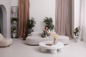
Placement matters: where and how to use accent colours
You don’t need to splash your accent colour across the room to make it work. In fact, less is more — that’s the minimalist mantra, after all.
1. Soft furnishings
An accent cushion, a woven throw, or a fabric lampshade can add a flicker of colour without feeling intrusive. It’s also easily changeable — perfect for seasonal shifts or mood updates.
2. Art and wall decor
Art is one of the best places to explore colour without commitment. A print with tones that echo your chosen accent adds a focal point while maintaining harmony.
3. Furniture detailing
A single armchair in a dusty olive or bar stools in soft sage green can speak volumes in a neutral kitchen or living room.
The approach is similar to how designers integrate layered neutrals with gentle material contrast, as discussed in using texture to add depth to minimalist rooms. The texture does the talking, while colour quietly sets the tone.
Accent rules of thumb: minimalist edition
Adding colour doesn’t mean abandoning your minimalist values. Here’s how to keep things measured and meaningful.
Follow the 90-10 rule
Use your primary neutral base for around 90% of the space. Use your chosen accent hue in just 10% — enough to punctuate the design, not dominate it.
Use tone-on-tone variation
Don’t just stick to one exact hue. Blend lighter and deeper tones within the same family to create visual depth. For example:
- Pair blush pink with dusty rose
- Layer sage with deep olive or pistachio
- Mix beige with muted clay and cream
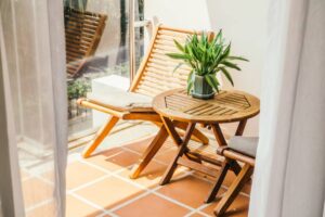
Let natural elements support the palette
Wood, stone, leather, and greenery all act as natural “colours” that enhance your scheme. A leafy plant can echo a sage-toned cushion, while oak floors support a clay-inspired palette.
Common mistakes with accent colour in minimalist spaces
Even subtle colour can backfire if not handled with care. Here’s what to avoid:
Clashing undertones
Mixing warm beige with cool navy might feel jarring unless bridged with transitional shades. Stay within one tonal family to avoid visual tension.
Overuse of contrast
A single accent is elegant. Too many accents can crowd a minimalist space. Stick to one hero hue — and maybe one supporting shade if needed.
Chasing trends blindly
What looks fresh on Instagram today might date quickly. Choose colours you genuinely love and feel at ease with, not what’s momentarily popular.
Real homes, real accents: subtlety in action
Priya’s neutral-meets-earth home
Priya’s London flat is a serene mix of oatmeal and ivory — her clay-toned linen curtains and a rust velvet armchair serve as her accent signature. The effect? Warm, grounded, and cohesive.
Luca’s kitchen refresh
Luca added soft sage green stools to his otherwise white-and-wood kitchen. Paired with eucalyptus in ceramic vases, the space feels fresh without fuss.
Anya’s romantic blush palette
In her minimalist bedroom, Anya uses blush pink in just two places: a velvet cushion and a framed art print. Against a backdrop of warm grey and white, the hue is soft, elegant, and inviting.
Conclusion: Colour that complements, never competes
Choosing an accent colour within modern minimalist decor is an exercise in elegance. It’s not about standing out — it’s about enhancing what’s already there. When used with subtlety and balance, your chosen hue won’t break the vibe. Instead, it will strengthen your aesthetic, making your space feel intentional, personal, and quietly beautiful.
Whether you lean towards earthy tones, soft pastels, or deeper muted shades, the secret lies in how you layer, where you place, and what you let shine. Minimalism isn’t about absence — it’s about clarity. And sometimes, a touch of colour is exactly what gives that clarity life.


YOU MAY LIKE